Work From Home Reporting
A big trend here, like across the nation, is working from home. We have adopted a hybrid model, with the focus on tracking productivity between the office and home. The data a is readily available and so I needed to build something that can compare work completed at home and office, as well as how the different teams do.
I started with my metrics. I started with six, three from each major work type:
Then I created a roster of everyone’s schedule so I can tack them onto each data point to note where it was completed.
And then its a matter of pulling in those data points.
And then adding the rest of the team to compare:
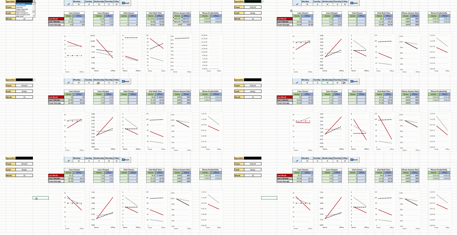
Now for the visualization part. With 2 points of data like this, the answer is pretty simple: Slopegraphs. I try to used them when I can, because seeing the sharp angle of can be more striking nearly any kind of graph.
And then making it a dashboard with a macro to adjust any changes in the employee’s schedule, you end with this:


