Gantt Charts without a Graph
When I was asked to create chart of our team tenures, I was given the following criteria:
Show how long employees were on our team over the last two years.
Make it filterable on several points of data.
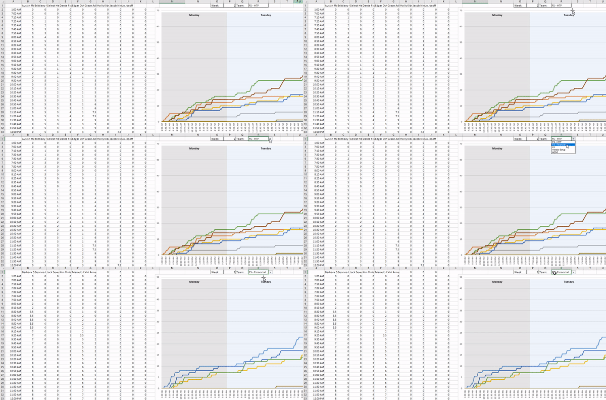
The second part tripped me up. I’ve made reports before that showed this info, but my dashboards usually have one or two dropdowns that feed a report and that feeds the a graph. I built this in the Progression reports that switches the teams:
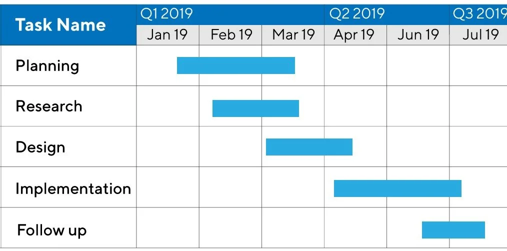
But this limits any kind of creativity when looking to filter out the data. After some perusing, I decided I wanted the best way to display the tenures using a Gantt Chart. These are primarily used for project tasks:
Instead of a report, I decided I would use conditional formatting on blank cells.
First, I built my Faux-Graph Headers:
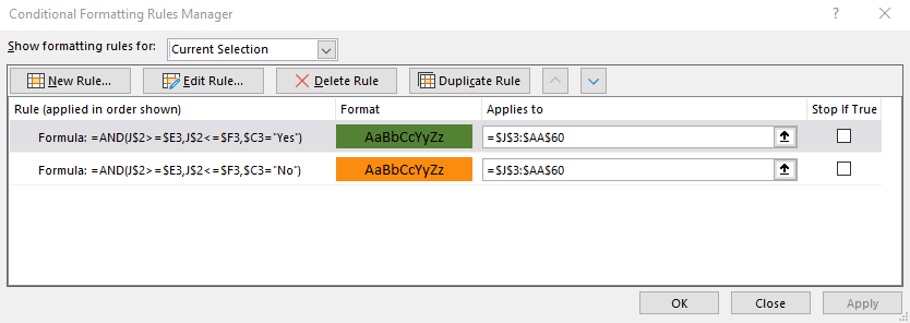
Then I built a simple formula in the Conditional formatting:
I added a second Conditional formatting rule to differentiate between the active and terminated employees.
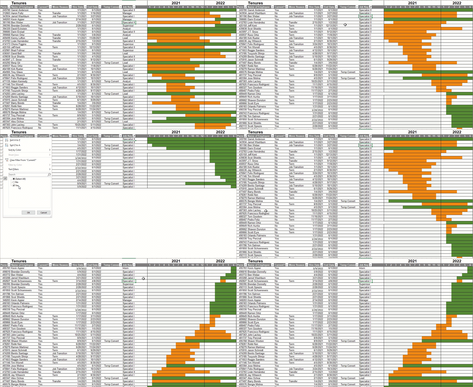
From there, its just a matter of plugging in your data. Once compeleted you get something like this:


