Charting Progression
I love seeing great moments in sports revised into data. Seeing big headlines with the graphs to back it up can bring new gravity to that historical moment.
One moment that stuck in my head was the 1998 Home Run Race between Sammy Sosa and Mark McGwire. The world was captivated by those two that year, chasing that 61 homer mark set by Roger Maris in the 1961 season. A lot of great Pre-StatCast reporting came out. One that visually told a story for me was FiveThirtyEight’s progression report.
I love this visual because it creates questions that might not have been asked. Questions like:
What happened to Sosa at the beginning of May?
What happened to Griffey in August?
What created the incredible production from McGwire after Sosa first caught him in August?
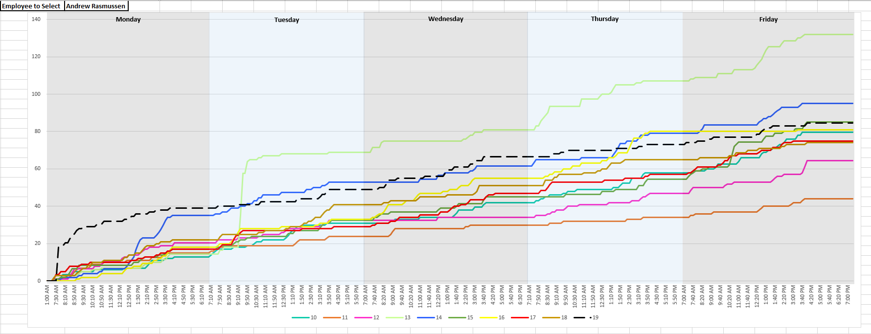
As you know, sports performance is similar to HR performance and when Ii saw this graph, I wanted to recreate it to see what questions we can ask our specialists. And after tinkering, i came up with this:
Where every line represents the weekly case closure of the selected employee.
As a lead, this encourages you to look for tendencies in your specialist’s daily habits, and if need be create action plans to counteract them.
This employee saw a huge rise in a production in Week 13, kicked off by a huge Tuesday morning surge. Something that was not replicated in the following weeks. That is an important question to ask about that timeframe in weekly QC.
You can also see lulls before the the 11:00 lunch times he takes. As a lead, it might be beneficial to kick over some encouragement to that employee at that time.
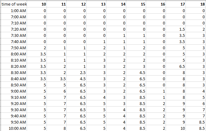
I used several formulas to build this report. Excel does not a have a Rankif formula, where it gives the earliest closed case lower than the cases completed at the end of the week, so i had to trick it using the report here.
From there, it was simple table to either log the ranking or use the previous ranking above it:


