Charting Progression pt. II
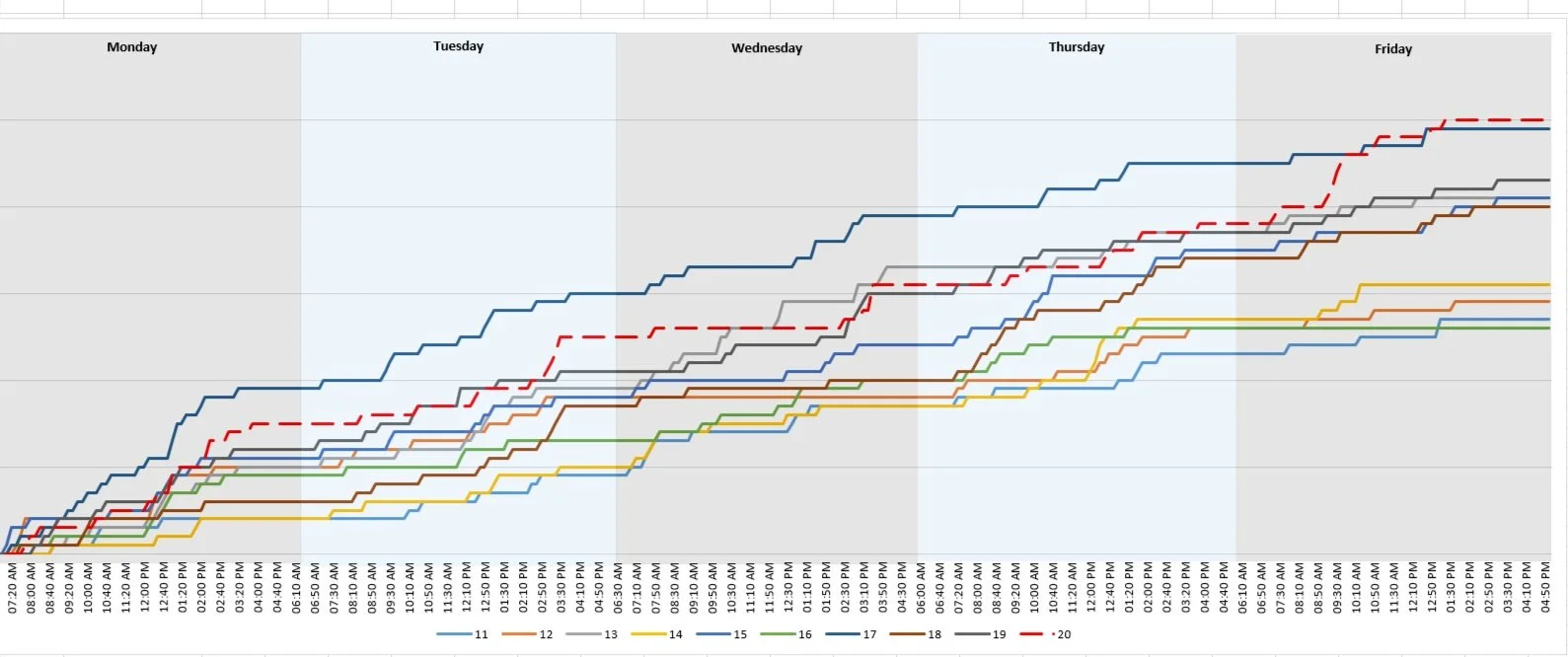
Previously, we talked about how to show a Specialist’s progression across a week:
And it gives you a good idea of how the specialists operate if every week is constant. But what if we want to break it down further? We have a couple options:
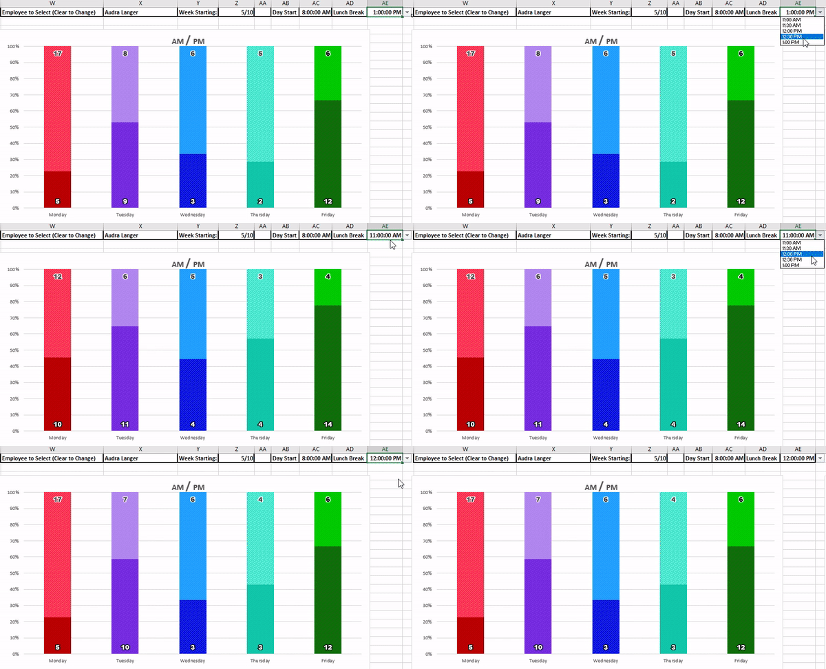
For something more general, we can break down the day by morning and afternoon:
With the option to change the lunch break time:
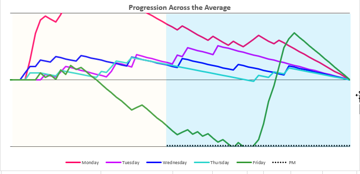
And then there is the option to chart the progression the same way as the weekly chart:
This gives you a wealth of exploratory data to find productivity.
The final chart looks at productivity where the total is the same across. It takes the daily total, finds the average completion rate at any time during the day, and then compares the specialist current rate to it.
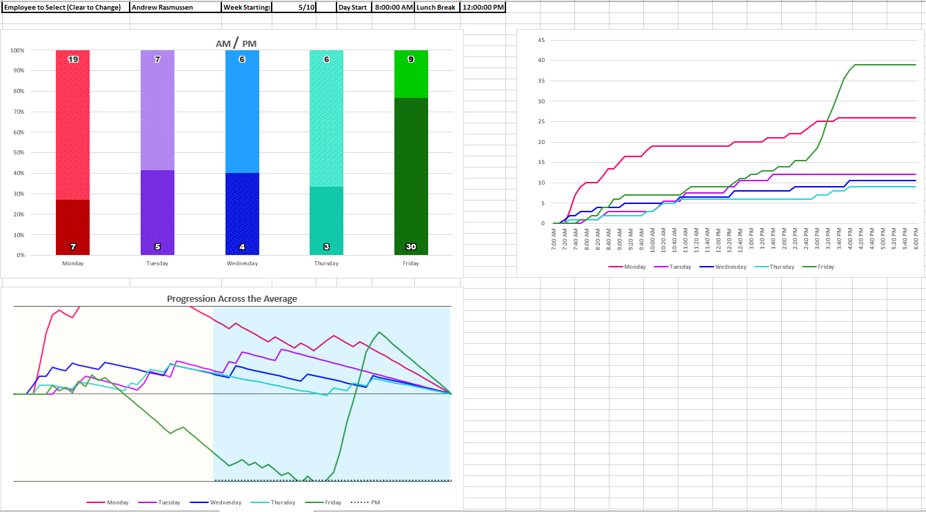
Here is the same specialist as above:
Looking Tuesday, Wednesday, Thursday, he completed less cases but at a fairly consistent rate, where his Monday and Friday show huge spikes of inconsistent productivity.
All together, it can give leadership a picture of how an employee spends their day and can create pathways on improved performance


